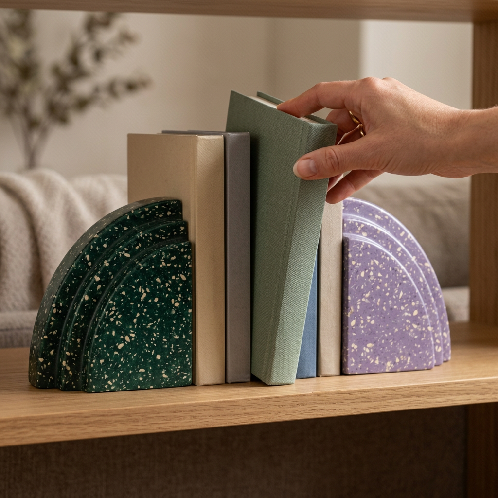
Monolith Stepped Bookend Pair — Emerald Green & Lavender Terrazzo-Look Accents for Curated Shelves and Reading Corners
Monolith Stepped Bookend Pair — Emerald Green & Lavender Terrazzo-Look Accents for Curated Shelves and Reading Corners
Couldn't load pickup availability

Monolith Stepped Bookend Pair — Emerald Green & Lavender Terrazzo-Look Accents for Curated Shelves and Reading Corners
Your reading corner, with a stronger point of view. 📚
A good shelf tells a story before you open a book. Monolith introduces two contrasting characters to that story: deep emerald green and soft lavender, each scattered with pale terrazzo-like flecks. The pair shares the same stepped, curved profile, creating a visual conversation between a darker, grounded tone and a lighter, more unexpected one.

01 / Shape gives the shelf its rhythm
Look closely at the outward-facing curves. Three stepped contours repeat across each piece, giving the profile the feeling of a small architectural elevation. The inside edges remain straight, creating a clear boundary for a row of books. When the pieces sit together without books, their mirrored forms create an almost complete rounded composition; separated, they frame the space between them.
That relationship is the heart of Monolith. The design is not a pair of unrelated ornaments. It is a deliberately coordinated contrast, with matching outlines and different colors. The pale flecks connect the two sides while breaking up the broad green and lavender surfaces.
02 / Color does the interesting work
Place the pair around neutral book spines and the colors become the main event. Set them beside a few richer covers and they feel like part of a collected, personal library. Warm walnut brings out the depth of the emerald, while pale shelving lets the lavender stand apart. You do not need to repeat both colors elsewhere. A single green chair, purple print, or cream textile can be enough to make the arrangement feel considered.
03 / Leave room for the books
Begin with a small, manageable group rather than filling the entire shelf. Set the flat faces toward the books and the stepped curves outward. Adjust the spacing to suit your selection, keeping everything upright on a level, stable surface. These are styling ideas rather than a stated load rating; choose books appropriate to the confirmed dimensions and specifications of your pair.
A shelf edit, not a complete room makeover
Monolith works best when the surrounding display has a little breathing room. Move the extra ornament elsewhere. Let one end of the shelf remain open. Introduce a horizontal stack on a different level instead of repeating the same layout everywhere. The resulting arrangement feels lived-in and curated, rather than arranged by formula.
Two colors. One shared silhouette. A more expressive place for the books you return to.
The design is shown as a coordinated two-piece set. Books, shelving, and other props in the images are styling accessories, not part of the set. The flecked finish is described by appearance and does not indicate a particular stone or material composition.
A closer look at the design